Seattle Pilots NHL Concept
A personal project to create a brand concept for Seattle's NHL expansion team.
As someone who grew up playing and following sports I've always had the desire to work on a project to create an identity for a sports team, and in my free time I often sketch and explore ideas related to logo and uniform design for baseball, football, and basketball teams. Here is one of those concepts that I created back when the NHL announced that Seattle would be getting an expansion team.
Choosing a Name
When considering what the name of the franchise should be, I wanted to ensure that it met the following considerations:
Relevant to the history and culture of western Washington
Gender and identity-neutral
Not a repeat of an existing pro team's name
The Seattle Pilots (1969)
Seattle's first pro baseball team was called the Seattle Pilots, playing only one season in 1969 at Sick's Stadium before moving to Milwaukee to become the Brewers.

I liked the Pilots name as a way of referencing the history of the city as well as the industry that built much of what Seattle is today. While it may not be the most exciting, adventurous name (the team ended up choosing "Kraken"), I thought the potential for using flight, airplanes, aerospace, etc. could provide a lot of inspiration for creating a brand and marketing language around the identity.
Colors
When exploring what color scheme to use for the team, I wanted to ensure the palette met the following considerations:
Feels cohesive with the palettes of the existing pro teams in the city
Feels unique in comparison to the rest of the NHL identities, and particularly from the Vancouver Canucks
Current Landscape
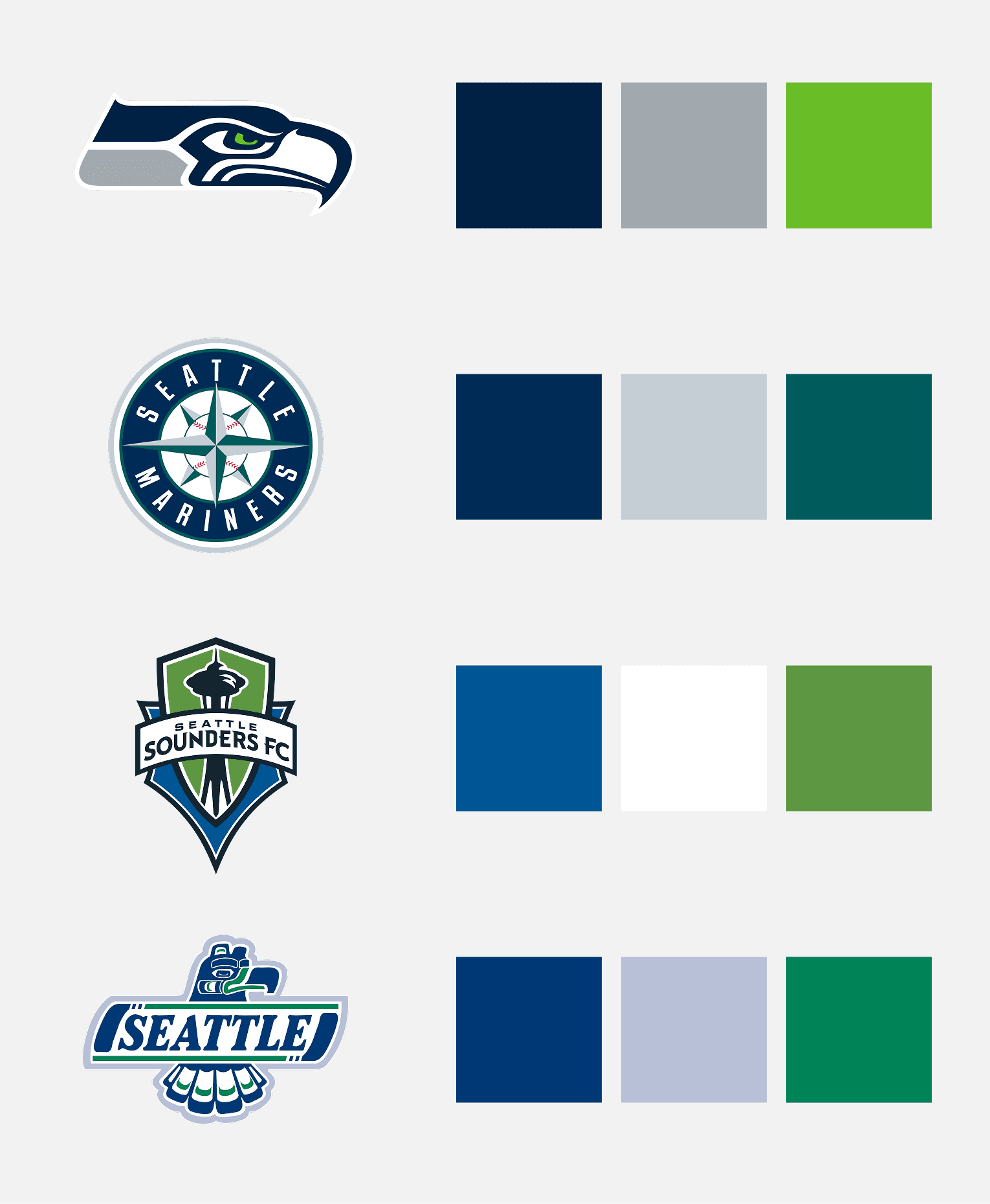
A blue/green palette is the unifying theme for teams in Seattle as it ties in with the colors of the region. There are other cities that do a unified color palette across their sports franchises (Pittsburgh being the most notable), and I felt staying consistent with the existing identities in the city would be the best approach for a new pro team.
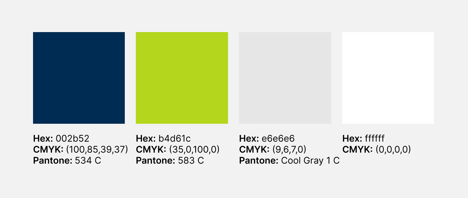
With the Seahawks being the most high-profile and popular team in our region, I chose a very similar palette to their navy and "action green" colors for the Pilots identity.
Logo
In moodboarding and initial sketching, I gravitated to the use of the city seal of Seattle. I felt the "S" shape created by the forms on top and bottom of the mark would lend itself well to represent motion lines when placed around a centered element. I also like the simplicity of the form and how it can be flattened to a single color and still maintain legibility.

From there I began exploring ways to represent a plane that would live within the center of the logomark, focusing on propellers and jet engines.

And then began combining the "S" form with the propeller forms in different variations to find the right proportions and level of detail in the flattened mark.

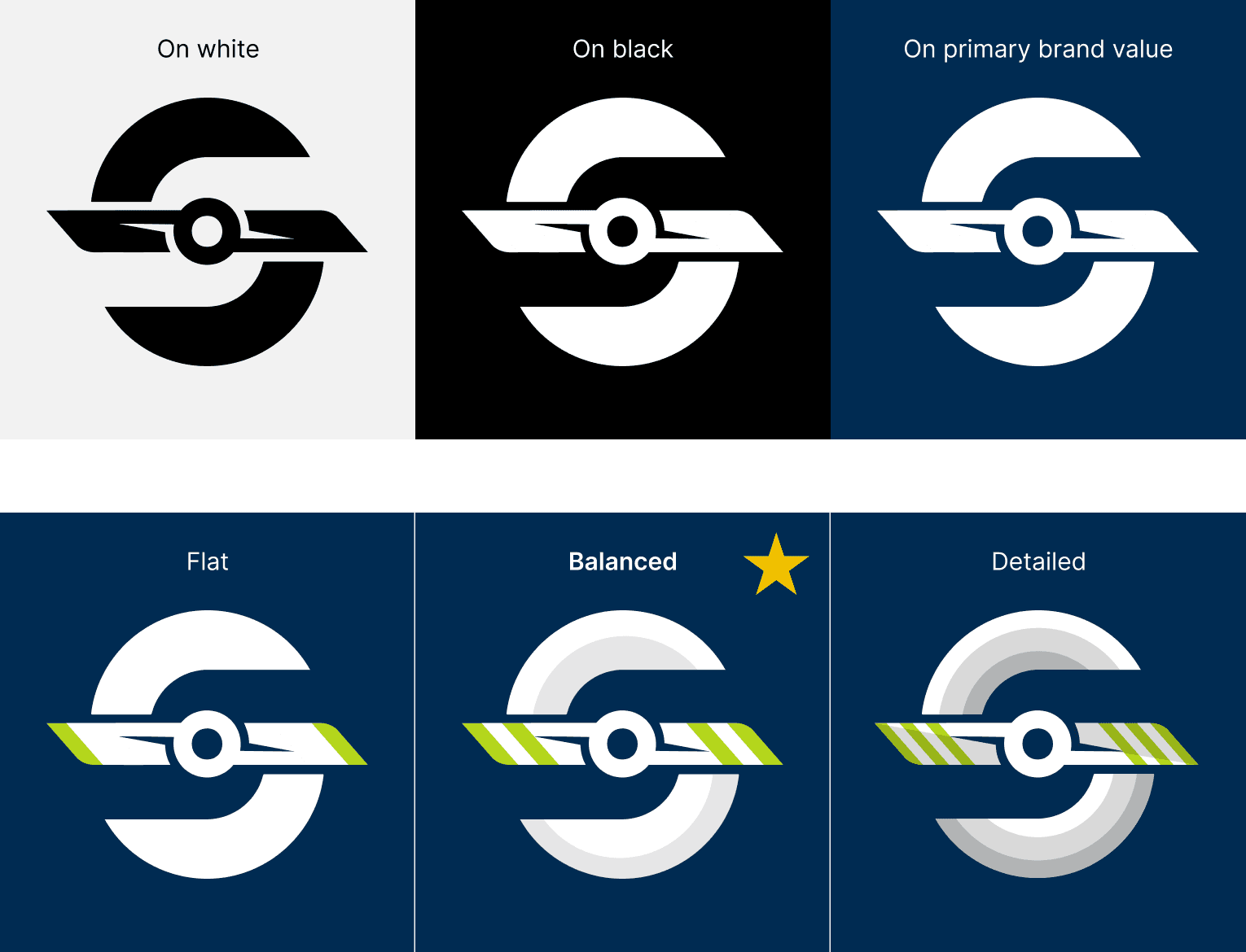
I felt the starred form above had a good balance of elements that communicated clearly and effectively:
Sharper propeller more closely resembles ice skate blades; feels fast and sharp
Motion lines are more clearly legible as an "S" while still feeling like a reference to the city's seal
From there I added detail in color and dimensionality to make it feel more refined and like a logomark that could stand on its own.
Typography
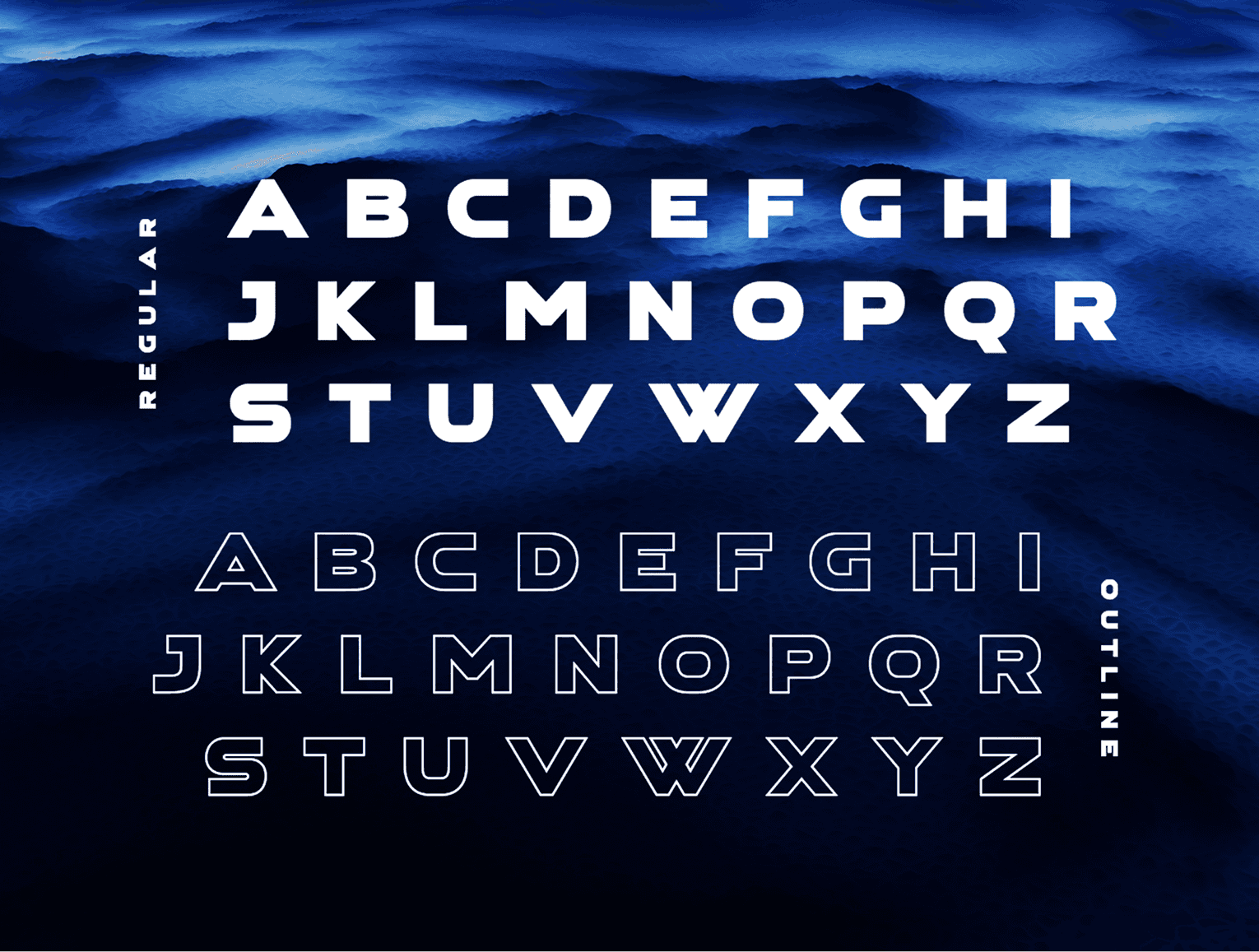
For the typeface I looked for something bold yet simple; something that matched the general simplicity of the geometry of the logomark while still having enough visual weight and prominence to live on its own as a display face.
I felt this typeface Aerospace from Sensatype Studios met that criteria in an effective way.
Bringing it All Together

Sharing the Work
Eventually I shared this project with my Twitter followers and on active forums like SportsLogos.net, where I have often posted design to gather feedback and impressions from other designers. Most feedback was positive and people seemed to like the logomark in particular.
I would like to use this concept for a team someday if the opportunity ever arises, whether that is for one of my sons' youth sports teams or for a professional project.


