Bing Olympicons
An icon set to represent the sporting events within Bing's Olympics answer experience.
As a search engine, Bing provides both algorithmic search results in standardized format, as well as highlighted "answer" experiences that provide users with more focused and in-depth results. One of those highlighted answer experiences is the Olympics as it is one of the most popular and closely followed sporting events in the world.
As part of the design of this experience, a unique set of icons were needed to represent the different sporting events that take place during the Summer Olympic games. I partnered with the lead product designer to create a set of icons that felt aligned with our broader Microsoft Fluent icon language, as well as stood on their own to enhance the experience of Bing's Olympics answer.


Research
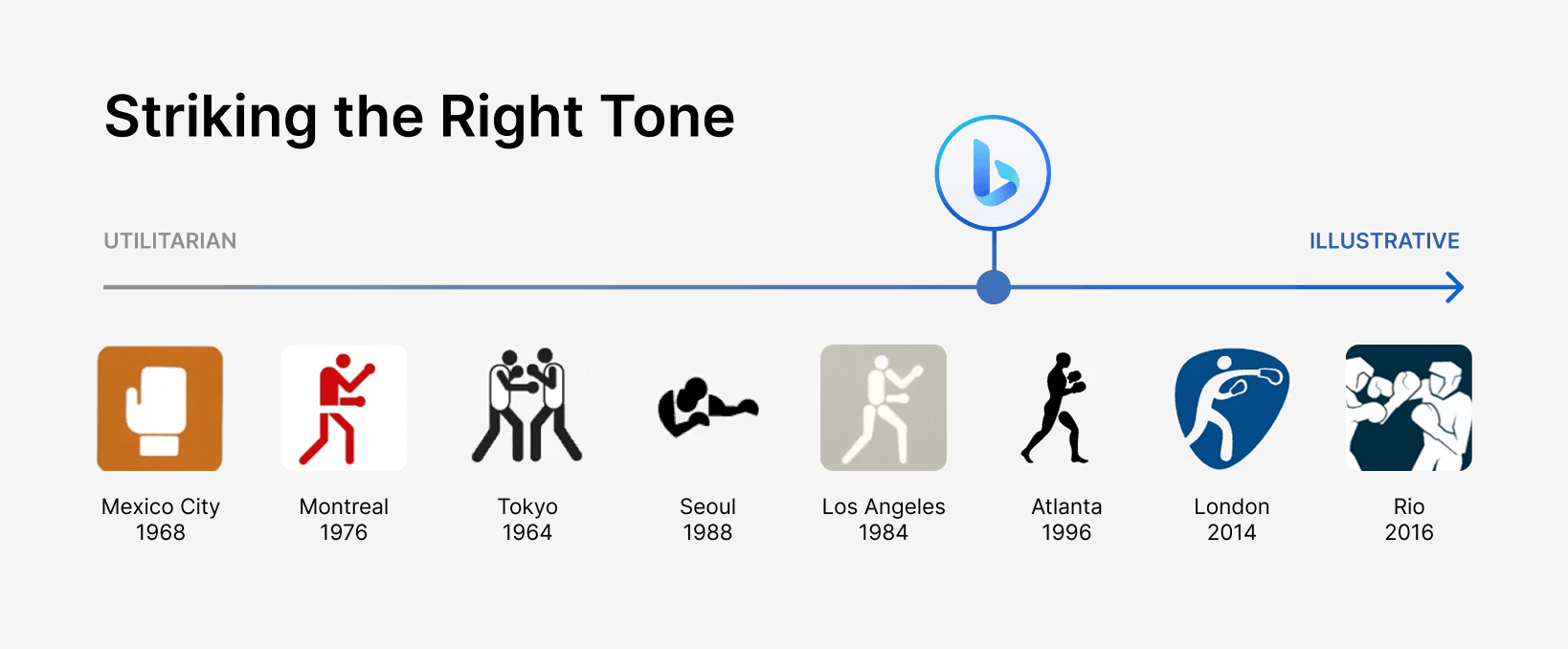
To begin this project, I went back to research the icon design of previous Summer Olympics, from the more utilitarian aesthetics of Tokyo, Montreal, and Munich, to the more expressive icon languages created for the events in London and Rio.
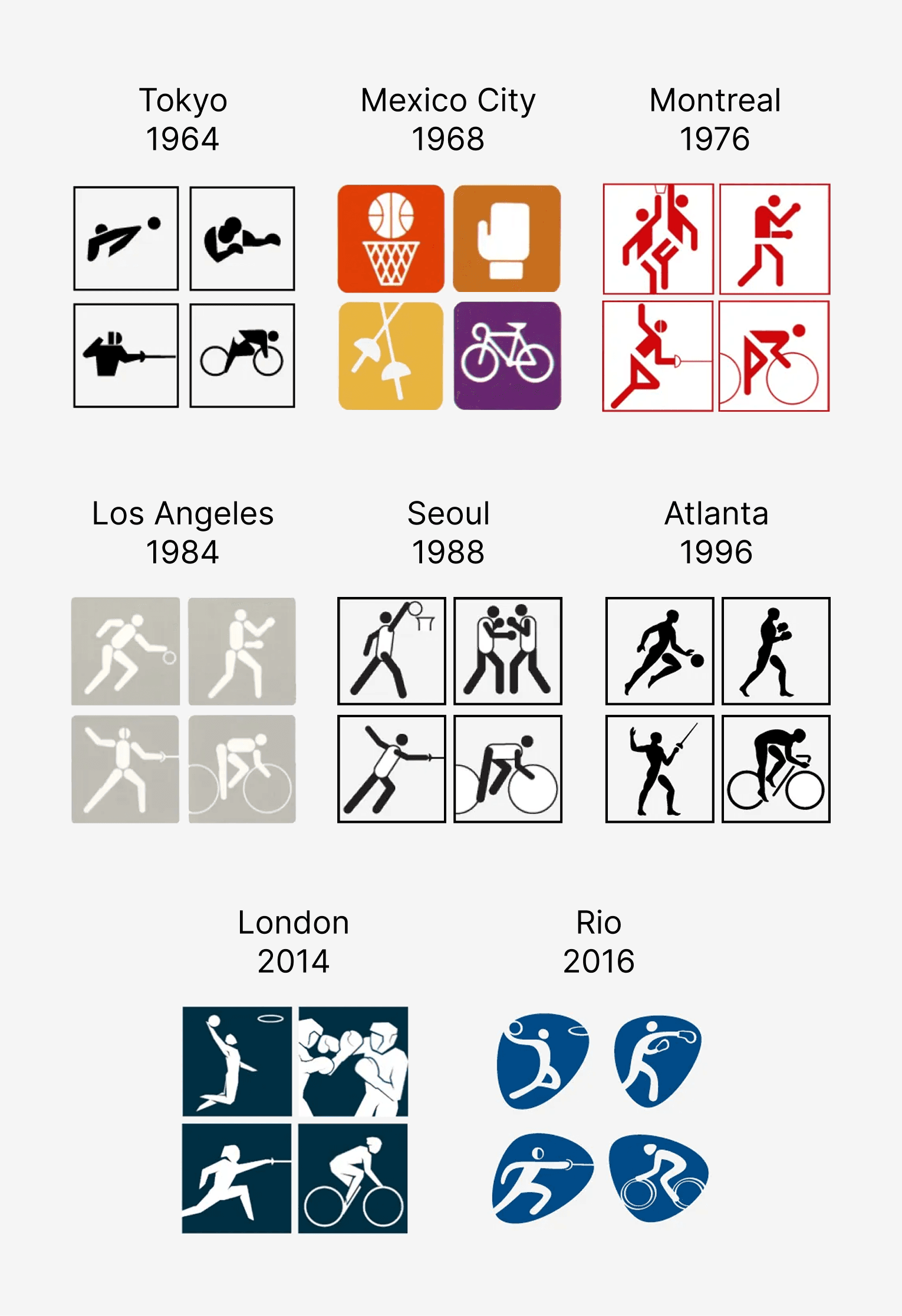
Microsoft Bing is to be thought of as a utilitarian tool, akin to a library or museum. The user should be able to research and learn about any topic they desire, and the platform should feel neutral. For this icon set, we wanted to strike the right balance between a utilitarian treatment of the iconography, while making it feel polished and refined to the point that it added visual interest and craft to the overall experience.
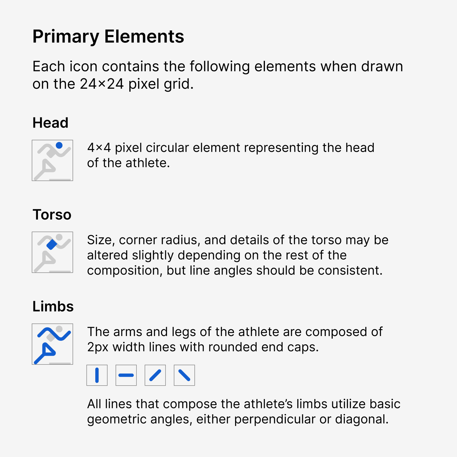
Defining the Icon Language
The baseline for these icons was set to the most common size used within the answer experience, and a size that could scale up or down as needed along Bing's 4px grid: 24x24 pixels.
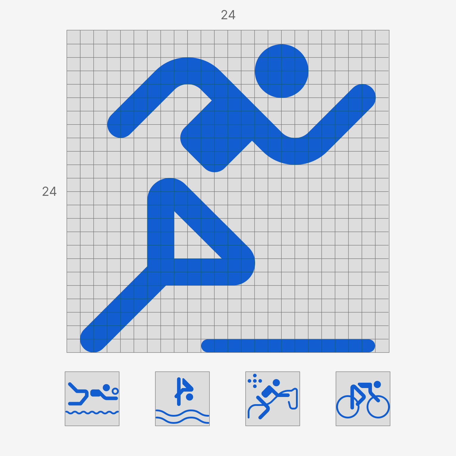
From there, the rules were defined around aspects like composition across the set of icons.
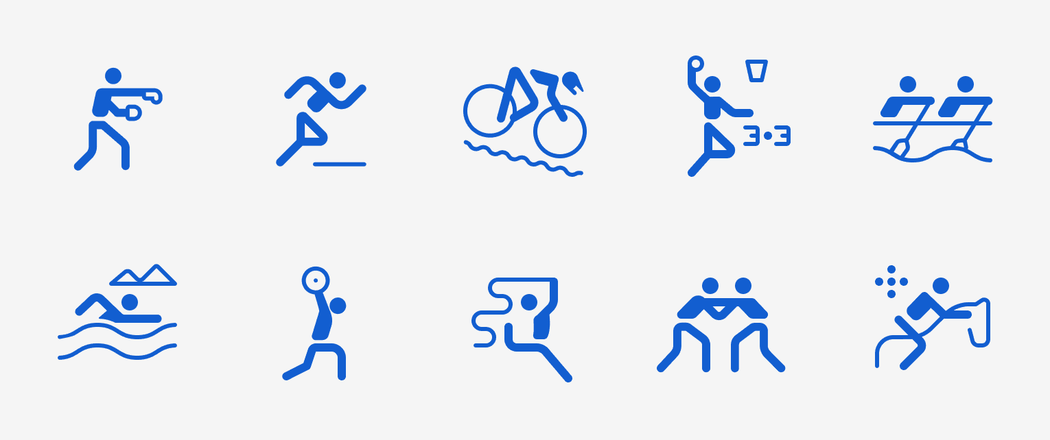
Execution
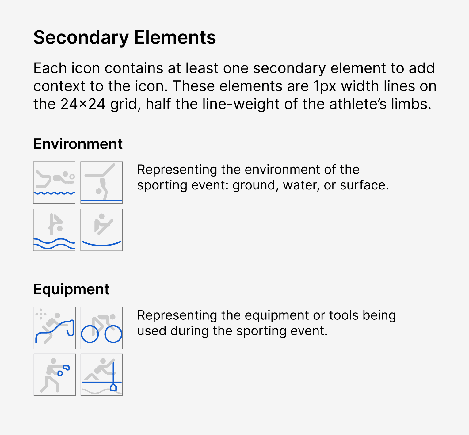
Over 40 icons were created to represent the events of the Summer Olympics. When viewed all up, the icons should hold similar visual weight and align to the same general visual language when it comes to the density and composition of each icon.
Application
The icon set was applied to the different answer formats and layouts across desktop and mobile, from smaller icon scenarios, to larger grid layouts.
This project was a good exercise in the process of defining and executing an icon language:
Identifying the proper tone and "feel" of the product experience that the icon set needed to live within
Setting the compositional rules for achieving a cohesive icon set
Applying those rules and executing the production of a set of 40+ icons
After design was finalized I worked with developers to hand off optimized PNG sprites for implementation.