Movie Cards in Bing
Optimizing the treatment for carousels at the top of the Bing search results page.
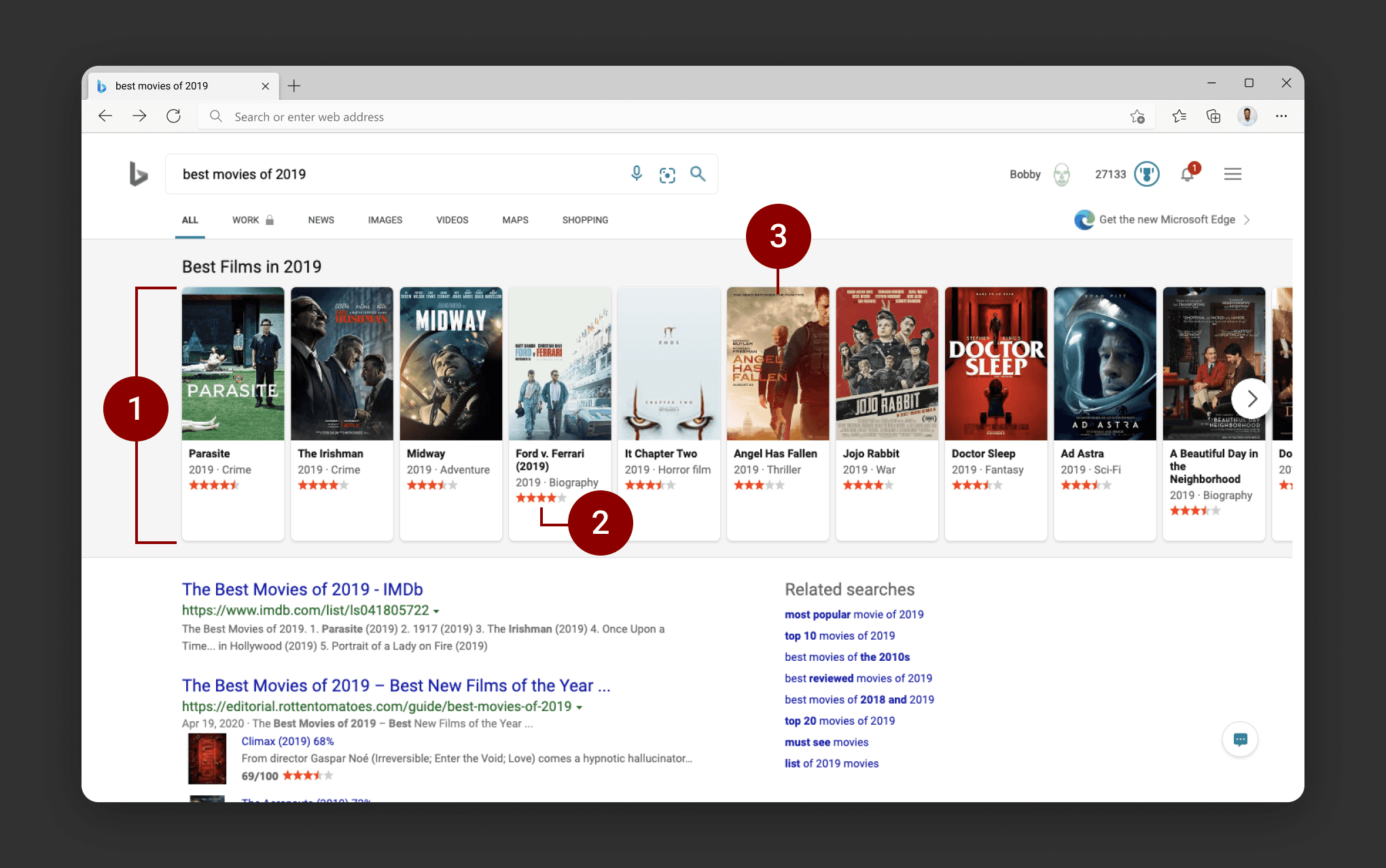
When a user queries in Bing for results related to a collection of "entities" (movies, books, celebrities, restaurants, etc.), they will see a carousel of cards at the top of the page. This is a way to highlight and draw more attention to content and related searches that are likely relevant to a user's original query. It also allows the user to pivot to a more focused search results while staying within the Bing search results page.
The existing design for the carousel results had issues related to space efficiency and interactivity, and our team explored potential solutions to update the experience.
The following is a treatment that was shipped for media-related queries like books and movies.
Objectives
The following issues were raised with the existing treatment of the "pole carousel" (top section of the search results page).

Vertical height of carding was inefficient
As a website in a desktop browser, what the user sees "above the fold" (within their browser window, by default), is crucial to engagement. The cards included excess white space at the bottom of the containers, and the clear separation between image and text created additional vertical space.
Star ratings lacked clarity and meaning
Where were these star ratings being pulled from? Were they coming from Bing directly? Were they from a ratings site that wasn't attributed within the cards?
Lack of interactivity with cards
There was opportunity to create a more engaging experience when a user hovered over each card.
Flighting
After exploring potential solutions for the treatment of the carding carousel and running multiple short-term tests, the team settled on a variation as a ship candidate.
Flight v1 Details | |
Name | Carousel Default Metadata + Wider Slideout |
Model | Slide-out |
Card size | 140x210 |
Description | Horizontal slide-out of card on hover. Additional metadata revealed within slideout. |
Gradient value | Black |
Segments | Movies, TV shows, books |
Flight Results | |
Consensus | Positive |
Sessions/UU (how many times a user performs an action within the Bing search results page and stays on the site) | +0.58% |
SBS (a side-by-side test run with a user base testing Bing's user experience vs. Google) | +23.2 |
Based on these positive metrics, the team moved forward with a ship decision for this treatment.
Addressing the Objectives
Vertical height of carding was inefficient
We reduced overall card height by overlapping image and metadata and expanded default image size.

Star ratings lacked clarity and meaning
We updated the metadata within the carded component to provide more clarity.

Lack of interactivity within cards
We created a more dynamic card framework that addressed the need for a more immersive and engaging carousel experience.

Ship based on positive engagement metrics
A +0.58% gain in Sessions/UU, which measures how often a user requeries or pivots within Bing but stays within the site, as well as a +23.2% side-by-side test result against Google's treatment was sufficient for shipping this experience in the pole carousel.


